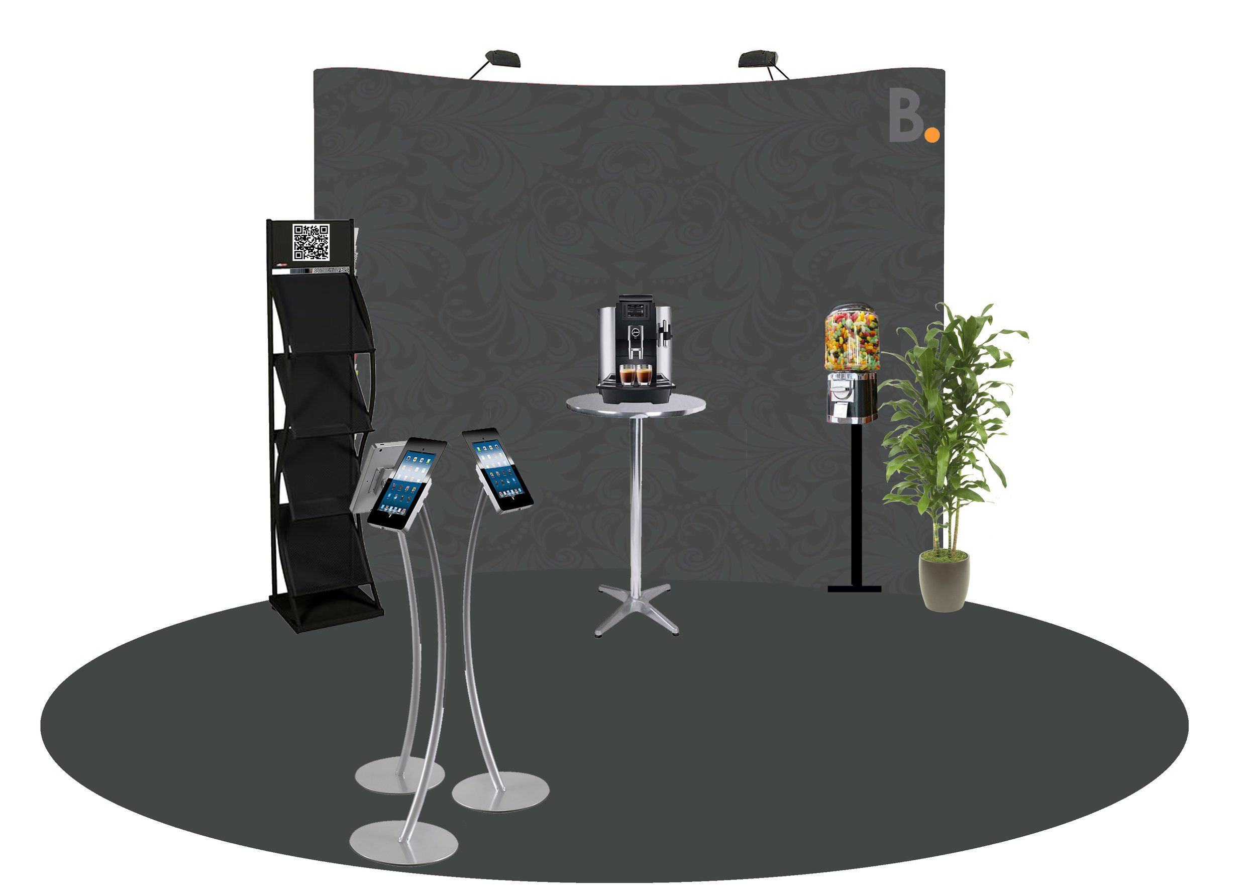
Recently Tom and I were asked for some help to design a Sales Stand by our Sales and Marketing Director Cath Jarrett. We’ve worked with our Sales Team before across a few different concepts but coming from a design and graphic illustration background, this was music to my ears!
Alongside our comms team, we were tasked with designing a concept that was ‘Coffee bar' chic for use at Shared Ownership/Sales trade shows, which met the following criteria:
Flat-pack for transit and easy to carry and set up for 2-3 people
Must convey 'cool' - or have something unique to attract passing customers
Must have places for customers to talk to sales reps
Incorporate technology and stimulate interest
The conventional approach for trade-stands is to wall your sales consultants in behind a table, creating a physical barrier to potential customers rather than being open and inviting. Psychologically, this arrangement has more in common with a job interview than a sales event, and was something we were keen to avoid in our designs (it turns out the driver for this set-up was simply the equipment provided by the event organisers). We believe that as we employ talented and personable sales consultants it’s imperative to open up room to manoeuvre and utilize the 3D space available to generate more natural conversations and, hopefully, sales leads. Furthermore, providing opportunities for self-directed interactions (like browsing product catalogues on mobile tablets, or helping themselves to some jelly beans) would encourage visitors to linger, browse and engage.
So Tom and Steve (Creative) and I started looking around for inspiration and what competitors were doing and wider trends in the interior design field, cultivating a look that was consistent with our branding. I mocked up a number of quick designs and here’s what we settled on:
Consensus reached with our sales team, the next step was to order and assemble all the components and have the opportunity to muck around with it in real life. We quickly spotted how for the slightly vertically challenged (no offence ladies and gents), assembling the rear screen could be a challenge - but workarounds were found. The concept was evolving.
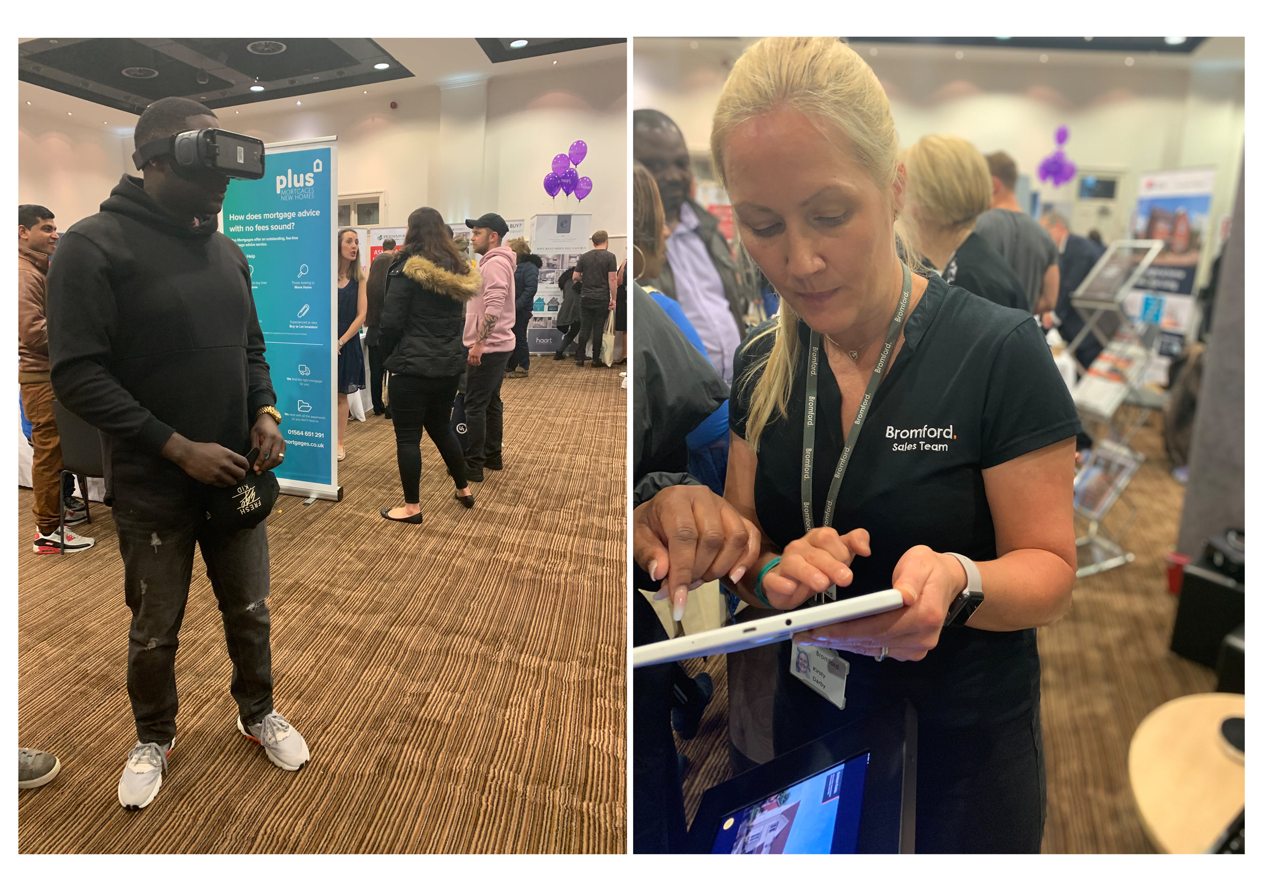
Following last month’s SoChat Hour and live Twitter design session (“How could innovation help more people onto the property ladder?”) we were keen to push virtual home viewings into a live environment. Using footage provided by Lichfield’s White Crow studio and the Matterport app, Tom and I used the Help-to-buy trade-show as an opportunity to gauge customer interest. Along with attracting more customers and providing a water-tight icebreaker, the VR headset (which went down a treat by the way) retained interest while sales consultants were busy with other visitors - but definitely needed another pair of hands to rove through the crowd.
As for the stand - we definitely stood out from the crowd. Visually this was one of the most interesting looking stands at the show. As designed, the sales team were able to freely move around and engage with customers freely. The two iPad stands were being used reasonably regularly, but the better value seemed to be from the free floating android tablet, which allowed Kirsty and the rest of the team to get customers details quickly and efficiently. The Jelly bean machine and Nespresso coffee aromas certainly enticed a few people to stop by and say hello.
The stand turned out how we had hoped, and for such a very modest investment the team were really impressed by the quality, professionalism and appeal. Even so, this is the start of our sales journey and more and more ideas and improvements are bubbling to the surface. We think - watch this space!


